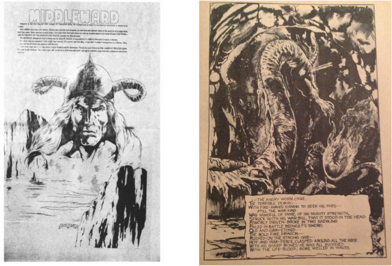
A very limited adaptation of Beowulf also appears in The Lands of Prester John, a 1977 magazine-formatted publication filled with early Mike Gustovich art, published by Noble Comics. In this issue, Gustovich (with inker Mike Gorman) provides four black and white illustrations that accompany text from the 1892 James M. Garnett translation of the poem, as well as a two-page centerspread with a head shot of Beowulf that is merged with an image of cliffs and the sea. Unfortunately for this adaptation, the ink wash used in the four main illustrations gives them a fairly muddy look, a problem that was fairly typical in black and white comic magazines of the time, such as Marvel’s Monsters Unleashed and Tales of the Zombie. The centerspread image without Gorman inks, in contrast, is sharp and is more along the style that readers of Gustovich’s later work are used to seeing.
The four text illustrations focus on Beowulf and the three main battles, with the first illustration featuring Grendel. This illustration is unique among most of the illustrated translations, as it shows him proportionally larger than Hrothgar’s thanes, easily holding several men and assorted body parts. Later adaptations would show Grendel more to the scale described in the poem, but here Beowulf is shown as being equal in size, which implies that he is a giant as well. This could be artistic license, or a reaction to the poem’s description of Beowulf’s greater stature as seen through the sentry's description of the character, or as a reflection of the idea that the character is a nephew of Hygelac, himself described as a giant in the Liber Monstrorum (Book of Monsters).
